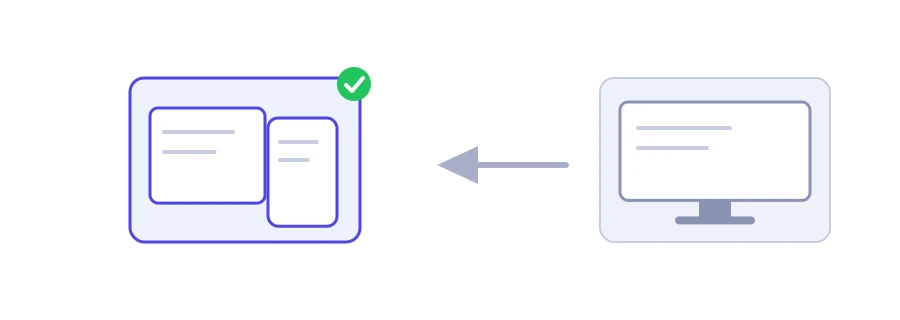
You design your site on your computer, while most of your visitors open it on a phone. Jood's Screen Resolution Simulator shows any page at the screen width you pick, from a 360 pixel Android phone to a 1920 pixel desktop, so you see how columns, menus and images line up for a visitor on that device.
How to use it
Paste the address in the "Page URL" box.
Pick a device from the "Screen Resolution" list, or choose "Other size" and enter the width and height in pixels.
Click "Start Now". The page is drawn at its real width, then scaled down to fit your screen, with the scale shown as a percentage.
The page inside the preview is live: you can scroll it and click its links.
Why 390 and not 1170?
An iPhone screen has more than a thousand pixels across, but the browser treats it as 390 pixels wide and draws each of those with several dots so text stays sharp. These logical sizes are what your site sees, and responsive design rules are built on them, which is why the list uses them.
Sites that refuse to be framed
The preview shows the page inside a frame (iframe). Many sites, such as Google, banks and social networks, forbid this for security reasons with the X-Frame-Options or frame-ancestors header. The tool reads the page's headers first. If it finds such a rule, it tells you instead of showing an empty box and offers an "Open in a window of this size" button. On a computer, that button opens the page in a separate window with the width and height you chose.
Limits of the preview
It only changes the page width. The site does not know you are on a phone, so if it serves a mobile version based on the device type, you will not see it here.
It does not imitate touch or pixel density, so text may look sharper or softer than on a real phone.
For a precise check, open Chrome's developer tools with F12, then device mode with Ctrl+Shift+M, and test on a real phone before you publish.
Sizes worth testing
Try at least 360 for small phones, 390 for the iPhone, 768 for tablets and 1366 for common laptops. Layouts tend to break at these points: a menu that does not turn into a button, a table that runs off the screen, an image wider than the page.
We use cookies to measure traffic and improve the site (Google Analytics), and may show ads later. Nothing is enabled without your consent. Privacy policy